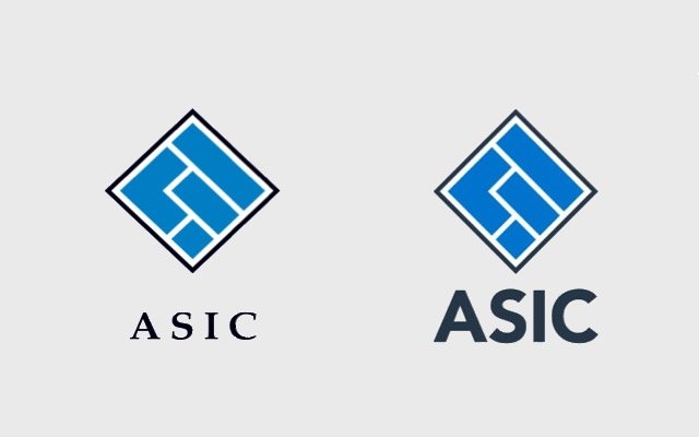
Australia’s corporate watchdog ASIC is being heavily scrutinised by furious taxpayers after forking out more than $100,000 on a barely noticeable rebrand.
The Australian Securities and Investments Commission (ASIC) started working on a new logo within weeks of the banking royal commission being announced in late 2017.
According to media reports, the regulator entrusted Sydney-based creative agency Folk to design a “contemporary” and “strong” new look that gave the impression that ASIC was “respected” and “accountable”.
The newly unveiled logo is the same diamond symbol containing blue Tetris-style blocks – but the font for ASIC’s name below is different.
The cost for this tweak surfaced in media reports yesterday and social media users have since attacked the organisation for wasting taxpayer funds on this less-than-impressive update.
According to reports, more than $43,000 plus GST was spent on “creative development”, close to $60,000 on “design and asset development” and almost $3,000 on the “web design update”.
The issue was first raised by federal Labor MP Matt Keogh, who asked ASIC to reveal its rebrand spend in October last year.
“This is a bold move by ASIC to focus on what sort of fonts it wants to use instead of actually applying scrutiny to the people we need scrutiny applied to,” he told reporters.
“When ASIC’s budget has been cut so significantly under the Liberal government, they can’t afford to be wasting taxpayer dollars,” Mr Keogh added.
ASIC’s response to the media was that its brand and font had not been updated in two decades.
“ASIC’s branding update was about making sure ASIC’s materials are suitable for digital channels – and digital is what the people ASIC regulates use,” ASIC senior executive leader of corporate affairs Matthew Abbott said.
The new look has been implemented on ASIC’s website, social media page and will be used in its publications and presentations.
In addition to the new font, the reworked brand consists of a new style guide and ASIC’s website is now typeset in Tahoma – a standard Microsoft Office font.
Social media storm
The debacle has erupted on social media with Australians calling out the organisation for its “reckless spending”.
“It does not represent value for money and it is not in the national interest,” one twitter user said.
Another twitter user joked she “could have got a better deal for ASIC, $10 from Vista Print for a new logo.”
On ASIC’s Facebook page one user commented, “100k for a logo change! I would have done it for a ham sandwich.”
Banking Royal Commission
The financial regulator came under fire for not cracking down on misconduct in royal commissioner Kenneth Hayne’s final report, released last week.
During the banking royal commission, ASIC was assigned to investigate close to 20 possible breaches of law.
Commissioner Hayne accused the organisation of being too soft on banks and treating them like clients.
“Negotiation and persuasion, without enforcement, all too readily leads to the perception that compliance is voluntary. It is not,” he said in his report.
