Have small cap stocks turned the corner?

While fundamentals are still of primary importance in investing, trends can help you find a better entry and exit.
Markets have been slammed, and economic evidence is pointing to a potential global recession – but it’s worth noting markets are forward looking, so at some point it’s likely they will stop going down and start going back up again.
Historically, markets turn positive well before the economic data, so it is important to look at previous trends.
Sure, it’s different each time, but stock markets are made up herds of people worried about their money, and herds are easier to read than individuals.
So, we look to the charts for guidance, as they are a visual representation of herd behaviour, and like any herd or flock or colony or pod, there can be patterns to their movement.
When general markets fall, the losses are often compounded in smaller companies, as they often contain a bigger margin of speculation, and often have more retail investors on their register.
And there has never been a bigger uplift in first time retail investors buying shares directly on the market, and many of them do not understand volatility and risk – until now! So panicked sell offs can become more common.
History would indicate that many will sell out in panic, and many will not re-enter, for fear that their initial losses will be compounded.
Some companies may never recover fully, as they did not have a viable business model to start with – and went up purely due to the retail frenzy of ‘buying everything that was going up’.
Investment quality
Going forward, understanding the viability or the quality of your investment will be much more important than it was.
You will need an edge from better information to make sure you are selecting the right companies. And perhaps the charts will help to indicate when it is safer to re-enter.
The S&P/ASX Small Ordinaries index (XSO.ASX) is used as an institutional benchmark for small cap Australian equity portfolios. The index is designed to measure companies included in the S&P/ASX 300, but not in the S&P/ASX 100.
The companies in it contain market caps between $1 billion and just over $4 billion – companies around the size of Lakes Resources (ASX: LKE), up to those around the size of JB Hi-Fi (ASX: JBH). The constituent companies are continually shuffled by the S&P as some get smaller and drop-out and others get bigger and are pushed higher.
But, there are some very interesting things to note from the long-term XSO chart.
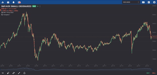
Small Ordinaries chart. (Marketech)
Looking at the above chart of the XSO.ASX from 2005 to present day, and a few interesting points immediately stand-out.
- It is now lower than it was before Covid.
- The first time the index reached this level was in 2006 – 16 years ago.
- It has not yet recovered the pre-GFC/mining boom highs.
But, as mentioned earlier, the constituent companies are ever changing, and the make-up of the index will be very different today than it was back then.
Smaller companies are typically much higher risk than say, Wesfarmers (ASX: WES), so it is worth considering as a retail investor that investing in smaller companies is often more about the timing of your investment – both in and out.
A chart of this nature can indicate whether the general backdrop of the market (and the herd) is generally positive or negative.
Signs the worst may be behind us
First, we’ll overlay some technical indicators. Some people think that technical analysis is the trading equivalent of reading tea leaves, but they do show some repeating patterns that you can use to help with your investing or trading.
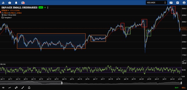
Small Ordinaries chart. (Marketech)
Fundamentals are still of primary importance, but the trends can help you find a better entry or exit.
Long-term moving average cross
One of the simplest and easiest trends to look for is the long-term moving average cross. This shows bigger, longer trend changes to remove some of the random volatility.
In the above chart, we have run a fairly common set of three trendlines over 8:25:180 days. Then drawn in boxes to show where the 180-day average crossed the shorter averages.
In 2012 to 2016 (the first orange box) – a bit after the GFC recovery, but before the mining recovery –the were no clear indications from the moving averages. The whole sector effectively trended ‘sideways to down’ for four long years.
There may be some comparisons made of the period post-GFC and this new period post-Covid, but we won’t know until much later. A big shock can take time to work its way through smaller companies.
But once the market had its first breakout of that trend in mid-2016, and found a new range higher (the second smaller orange box) it then began a nice run up to the end of 2018. Believe it or not, the 2018 sell-off was when investors first started seriously worrying about the coming economic slowdown.
Then, the moving average cross would absolutely have saved you, and it went on to indicate that you could have re-entered for the next upswing to the very beginning of Covid. And got you out almost immediately. That would have been nice …
Note that the post-Covid re-entry signal was not at the bottom, but well into the bounce. That’s how moving averages work, they confirm the trend, not pre-empt it. There are other tools for that.
Then exiting on the MA cross would have saved you from this latest sell-off some months ago, around the 18th January, before another 20% was wiped off the index as a whole.
Of final note, there hasn’t been a positive cross for re-entry just yet.
But, as with the covid sell-off, that doesn’t mean that we haven’t hit the bottom and that this isn’t the rebound. It just hasn’t confirmed a general trend change. Often, sell-offs become obvious much sooner after a long period of relative stability, but rebounds can take a while. It is a 180-day moving average after all.
So, we could be in for a 2012 to 2016 style ‘sideways to down’ period, or we could have seen the bottom and there may well be a sharp recovery, but this one indicator, the moving average cross, hasn’t yet confirmed that the longer-term trend has changed.
What history may indicate is that this is more of a traders’ market, or a stock picker’s market. And to become a better stock picker you will need the best data and tools.
Professional market data and trading platform
That’s been an issue for many who wish to use such techniques and tools when determining when to enter or exit a position.
Marketech is one company that says it has built a professional grade market data and trading platform for the retail investor.
Prior to Marketech, managing director Travis Clark was a full-service stockbroker for 13 years.
“As soon as I left the industry, I logged on to open an online trading account. Straight away I could tell that there was a big difference between the tools that a professional takes for granted, and those that the retail investors were able to access.”
“We believe that Marketech Focus offers the best of everything – live-streaming prices, high level charts, alerts, various trade types, etcetera. But we also made it easy to use, and affordable.”
“For $45 a month you get all the tools on both PC and mobile, and then trades are $5 or 0.02% on HIN, with a Macquarie CMA for your cash,” Mr Clark said.